Setting up an iPad from the perspective of a legally blind person
I would argue that setting up a new iOS device is a harrowing experience for everyone. Long past are the days when removing a new iOS device from the box and using it as your device was a painless procedure of a few seconds. The setup process is a real process. Even so, the process is exponentially magnified for people with accessibility needs, in particular, low-vision.
Out of the box, I cannot use an iOS device proficiently. For me, it is a matter of font size and weight. Entering passwords is a nightmare. Even worse is trying to determine which password is being requested. I use different accounts for iCloud and Apple ID. Get those wrong a few times, and you will find yourself locked out for a few days. Good luck with that.
Even if you skip those passwords (as I often do), you still have to run the gauntlet of other selections that you have to make before you can start using the device.
Once in, the first thing I do is head for the accessibility settings and start working on the text to make it usable. Before starting this article, I did something I dread. I went into Settings, General, Restart, and sapped all the settings for this device.
I was in my office with the lights out. And my first reality was that auto-brightness was engaged. And the screen was too dim for me to see what was on it, size not withstanding. Auto-brightness is far too aggressive on the low end. One of the things required for people with low-vision is light, usually, the more the better.
Display & Brightness
A trip to Display settings is the first stop even before Accessibility. Much of what you need is in Display & Brightness. Here are the things I adjust while I’m there;
- Adjust the brightness so that I can see the screen comfortably
- Turn off Auto-brightness
- Turn off Auto-lock by switching it to Never
- Crank Text Size up to high
- Switch Bold Text to On
Because of poor vision, I tend to read a little slower. I sometimes have the screen read aloud to me. The default is that the screen turn off with 2 minutes of inactivity. That is not enough time, and becomes very annoying. I always make sure my screen does not turn off until I want it off.
Switching on Bold Text gives all the text a heavier weight. That is something that can make a big difference for everyone. Just be aware that when activating this setting, the iPad will do a quick restart. Don’t panic. It’s normal.
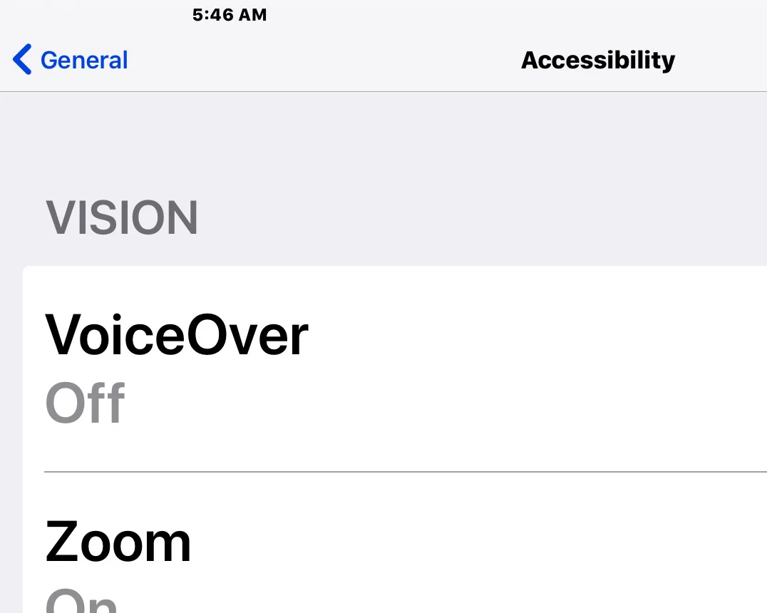
Accessibility, Vision
Under the second section in Vision inside the Accessibility setting is something called Large Text. You might think we have already dealt with this one. But this is different from Text size. Text size deals with the size of text within apps. Large Text deals with the size of certain interface text elements.
Once this option is engaged, it takes over the text size of both inter-app text and system fonts. Some system fonts like the time at the top of the screen will not be affected. But the size of list fonts will be enlarged accordingly. If you are serious about increasing the font size, this is the place to go.
It is important to note that there can be unintended consequences to increasing the font size. In Ulysses, Line Width is an option when Large Accessibility Sizes is not engaged. Turn on Large Accessibility Sizes, and that option disappears depending on how large the text is.
Other collisions have to do with certain types of email messages. The text can get jumbled and stacked atop itself because the text could not flow appropriately. You either have to decrease the fonts to read those messages, or write them off as unreadable. Other messages will not allow increased fonts at all. (As if we needed more reasons to hate email...)
The other type of unintended consequences is that you will just receive a lot less information on a line. The News app is set up like a magazine. When headline text is increased, you get less of the headline that trails off into ellipsis. This also happens with lists, as in Contacts and Music. The entire name of that song or album is simply not going to be displayed. Your text is too big. Sorry.
These are annoyances low-vision users have been putting up with since the beginning of large font options on computers. No one gets it right. And it is just a matter of who does it less badly. IOS 11 is a lot better at some of this. But there is still much room for improvement. Either way, a person with low-vision has to use these settings. Without them, the machine is all but unusable.
Zoom
It has become almost impossible for me to use a computer without Zoom. That is a feature allowing a person to zoom in, temporarily enlarging the screen as if a camera operator has zoomed in for a close-up. On iOS that is done with a 3-finger double-tap. But before engaging the zoom, you have to set it up.
Under Accessibility, you will enter the Zoom sub-menu. Once you turn it on, you will find that a small window appears on the screen. If you like having a virtual magnifying glass on the screen when you need it, leave it as it is. I prefer having the entire screen go to zoom. Scroll down to Zoom Region and select Full Screen Zoom.
There are lots of features inside of Zoom that I will not detail as I do not use them. I am just focusing on what I go through when setting up a new iOS device. It can be much worse than this.
Magnifier
A relatively new accessibility feature for iOS devices is Magnifier. It turns the Device into a digital magnifying glass. This feature makes the most sense on the iPhone. But I am glad it is also on the iPad.
It turns the iPad into a CCTV of a sort. With the magnifier engaged, and the iPad in typing or presentation mode, you can set down a piece of paper or a book in line of sight of the camera and read it in relative comfort. It is not ideal. But it works quite well in a pinch.
You enter Accessibility, then Magnifier. You will need half an article to learn how to get the most from it. But that is how you turn it on. It is always a part of my setup procedure.
Contrast
Another one of those visual aids for people with low-vision is cranking up the contrast. This can be done in a roundabout way on iOS. As expected, you start by entering Accessibility.
There is an option called Increase Contrast. But there is no slider as one might expect. Instead, there are 2 options. The first is to reduce transparency. The second is to darken colors. The second is the one I use. It does not interfere with photos. It just makes certain interface elements darker. The effect is subtle but useful.
Talking Back
With that, we have completed the first phase of low-vision setup. So far, everything we have done has been in service of making the text more readable. These are settings that can benefit just about everyone at some point in their lives. But accessibility power users are going to need to enable the next phase of low-vision power tools.
These tools are all about speech. When you have low-vision, there are times when no amount of text manipulation will get the job done. You have to have the device talk to you. The most well-known speech feature is called VoiceOver. It is a builtin screen reader for the blind.
It is more for the blind than for the visually impaired. That said, there are many instances where it is the only tool that will get a particular job don for the visually impaired. So activating it is always a part of my setup procedure.
Disclaimer, if you are following along, I do not recommend you do any of these procedures as this is not a tutorial, just a walkthrough of my setup process. Never turn on VoiceOver unless you know how to turn it off.
VoiceOver is the top feature in accessibility. If Siri is activated, you can turn it on by telling Siri to turn on VoiceOver. You can turn it off the same way. But for VoiceOver users, that is not enough. We also have to set up the voice we want to use, as well as the rate of speech. There are other settings to dial in. But those are the only ones I use.
For me, voice setup does not stop with VoiceOver. It continues with the Speech settings under accessibility. I turn on Speak Selection as well as Speak Screen. Sometimes, I will activate Highlight Content. Even if you have set up voices in VoiceOver, you have to do it again in Speech settings. They are different voice settings. So you can have different voices with different pitch and rate settings for the two modes.
When Speak Selection is activated, any text you select on the screen can be read aloud to you. This is a little like the audio version of the Zoom feature. Speak Screen is rather more comprehensive.
Let’s say you have an article you want read aloud in Safari. There is no need to select the text. Just swipe down with 2 fingers from the top of the screen, and it will start reading the entire screen aloud, advancing to the next screen until there is no more text. In this way, you can read an entire book in iBooks. It even continues reading when the screen is locked.
These accessibility settings are not complete until I go to Accessibility Shortcuts at the bottom of the Accessibility menu. If you triple-click the home button, that brings up a selection of accessibility options. You can choose what shows up there.
I select Magnifier, VoiceOver, and one we might talk about in a later post, Smart Invert Colors in iOS 11.
Only after setting up these options can I move on to setting up the rest of the device. For those with special needs, setup is a bear. What makes it worse is that Apple does not allow us to save the settings in iCloud so that we can just make them a part of our backup. That would make all the difference.
David Johnson